
Colour Ratios, White Balance, and How to Use Them to Improve your Photography
In photography we are always taught about how to use light, lighting ratios, modifiers, HSS, dragging the shutter, etc. But today I want to talk about using colour and your white-balance together both creatively and with a more utilitarian technique to create in-camera images that can really pop while still having a natural look.
All of the photos in this post were shot on the Fujifilm XT-1 and using a couple of Cactus Image speedlights (RF60 or RF60X) using a variety of lenses. To get started let’s go back to artschool 101 with colour wheels. When working with coloured light the colour wheel you are probably used to will likely steer you in the wrong direction. The colour wheel you are most acquainted with is the additive colour wheel, which looks like the diagram below (Fig. 1.1)

This is used in painting and such, the reason it gets its name is because SUBTRACTING pigment brings you to white while the additive colour wheel (fig. 1.2) — ADDING colour brings you closer to white and this is what we use with light, and therefore photography.

As you can see, the difference between the two images is rather subtle but very important. Without getting TOO technical let’s look at what affects white balance/tint — you can see that green and magenta are opposite in the above diagram as is orange and light blue. When white-balancing, if the image is too blue, you add a bit of yellow/orange and if the image is a little too green we add some magenta to neutralize it. If you look up to the subtractive colour wheel, this isn’t as accurate.
This is all very important when you’re dealing with using gels in a utilitarian way. I want to show you how I did this in the image below (Fig 2.1).
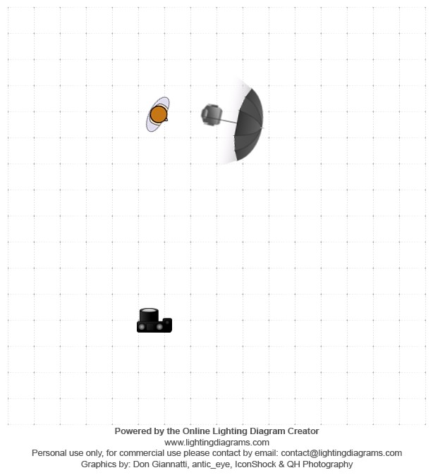
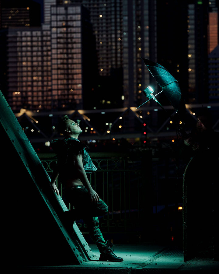
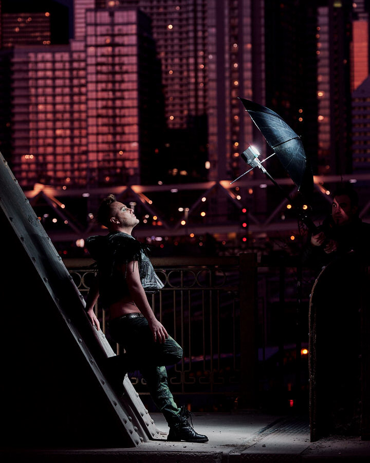
This was shot with the Fuji 50–140 2.8 shot at 93mm F4. There is a light firing into a reflective umbrella camera right (Which was removed in post) (Fig 2.2). Now, this was shot at sunset/blue-hour and I wanted the background to go a purple/pink as the client, singer Danny Dymond, wanted everything to be super neon glam and I was so in!
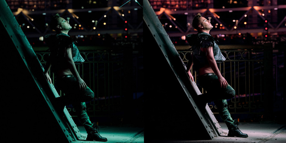
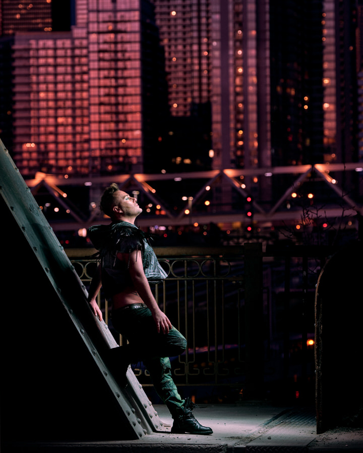
Since I wanted the background to go purple/pink I can look at our additive colour wheel and see that if I add green/turquoise to my light, by contrast, the background will go the colour I want by contrast. This is similar to wanting something to be brighter — you increase the power of one light so, by contrast, the other lights are darker in relation to it. By adding green/turquoise to my light, everything else is allowed to go pink/purple by contrast. You can see below (fig 2.3) what the image looks like with the ‘normal’ white balance, and green gel and then, beside it, what it looks like with the green-gelled light pushed to a neutral colour, pushing everything else into the pink/purple range we’ve been talking about. (fig 2.4) — You can also see Giancarlo Pawelec holding the light! I’m usually his assistant but that day we swapped roles.
Try JPEGmini Pro For Free Now!
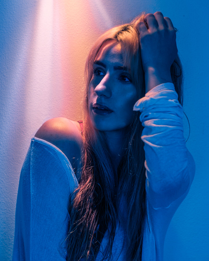
You can also do this much more subtly like in the image below (Fig 2.5) where this was shot, again, with a single RF60 but this time it was using a shoot-through umbrella and shot with a 28mm 1.9 Vivitar series one lens. For this, instead of using a heavy green gel, I used a 1/2CTO on the model, so that when the light hit her and when I corrected — the background was pushed bluer (which I pushed a bit more green in post because it just felt right).
This technique of using the ratio of colours to each other can be really pushed to the extreme. Sunlight, as we know, is rather cool in tone at 5500K. But we can push that further and further if we can get a light orange enough. If we look at the next two images (Fig. 3.1, Fig 3.2), which were both shot with a single speedlight, with enough orange gels to allow the sunlight to go totally blue giving us a graphic image.
As you can see these look impossibly blue — but it is actually just sunlight giving us that blue colour and the other light is SO orange that when I pull down to make it a bit more neutral — the sun goes that electric blue.
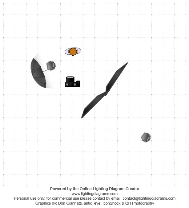
You can also do this sort of colour-balancing in a studio environment without the sun. Let’s break down this next image (Fig 4.1) of Toronto drag queen Silencia. This was shot in studio, where all of the light was done with Cactus Image speedlights.
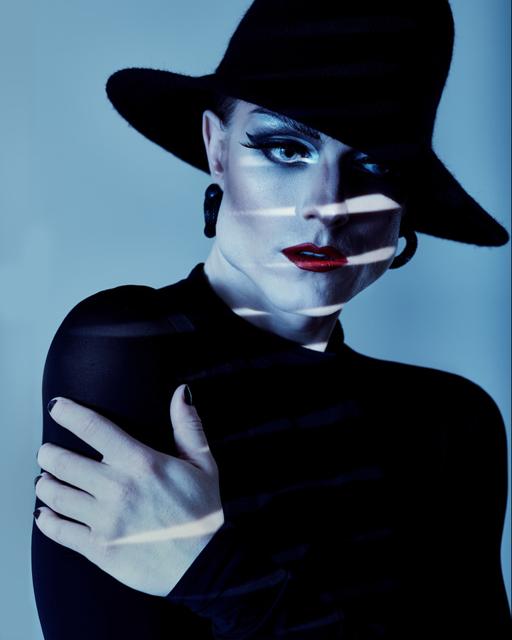
I wanted the image to be graphic and really POP so to do that I needed to have the light hitting the subject’s face not only a different brightness, but also a different colour. I could have gelled that light but I felt that it would be easier to gel the keylight blue so that the slats of light are more white by contrast.
This image was shot with two lights. The key, gelled blue, was firing into a 165cm reflective umbrella and the other was firing through a sheet of cinefoil (A sort of black thick aluminum foil), with some slits cut into it to create those slits. If you want those sharp shadows, you have to remember that the smaller the light source the sharper the shadows (Generally) so I’ve moved the speedlight far away to keep those shadows super sharp.
In conclusion, I hope that this post will help you learn a different way to utilize colour and gels in your own work to see that they can be used beyond just adding a pop of colour, or funky effects, but rather you can use the ratio of one colour and another to create a whole manner of effects.